Color decisions intimidate people. Furniture can move. Art can rotate. Paint and wall coverings feel permanent. That hesitation is exactly why blue wallpaper has become one of the safest and most effective design choices available. Blue adapts to different rooms, lighting conditions, and styles. It works in traditional homes. It works in modern apartments. It works in commercial interiors.
This article explains why blue works so consistently, how to choose the right shade, and how designers use it to shape a room’s mood and function.
No guesswork. Just practical design guidance.
Blue Is Psychologically Comfortable
People respond to color emotionally.
Blue consistently signals:
- Calm
- Stability
- Cleanliness
- Trust
That reaction is not random.
Hospitals use blue.
Airlines use blue branding.
Financial institutions use blue logos.
The color lowers tension and reduces visual fatigue. Rooms painted with intense warm colors can feel smaller and louder. Blue does the opposite. It expands visual space.
Blue makes rooms feel breathable.
Shade Selection Matters More Than the Color Itself
Not all blues behave the same.
Designers break blue into categories:
- Navy
- Denim
- Slate
- Sky blue
- Powder blue
- Teal-leaning blue
- Gray-blue
Each shade changes the room’s personality.
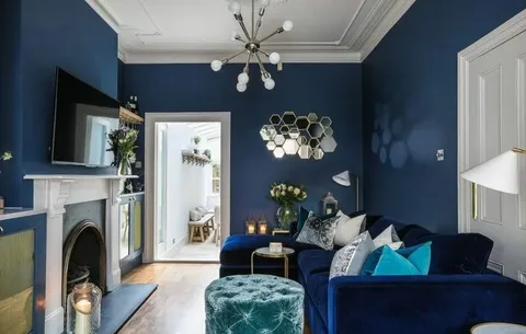
Navy feels formal.
Sky blue feels airy.
Gray-blue feels modern.
Powder blue feels relaxed.
Choosing “blue” is not enough. Choosing the correct blue determines success.
Lighting Changes Blue Dramatically
Blue reacts strongly to light.
Natural daylight shows the truest color.
Warm indoor bulbs soften blue.
Cool LED bulbs sharpen it.
North-facing rooms intensify cool tones.
South-facing rooms warm them up.
Always test samples.
Put them on multiple walls.
Observe morning and evening.
Light decides the final result.
Blue Expands Small Rooms
Small rooms often feel tight.
Dark trim and heavy colors worsen the problem.
Blue helps visually enlarge space.
Why?
Blue recedes visually. Warm colors advance toward the eye. Cool colors move away. Walls feel farther apart.
This makes blue excellent for:
- Hallways
- Small bedrooms
- Apartments
- Offices
- Bathrooms
Blue increases perceived square footage without renovation.
Bedrooms Benefit the Most
Bedrooms need calm.
Stimulation hurts sleep quality.
Blue supports relaxation.
Sleep researchers often connect cool colors with lower mental stimulation. Designers apply this principle directly.
Good bedroom blue choices:
- Soft navy accent wall
- Pale blue full room
- Patterned blue wallpaper behind the bed
- Blue grasscloth textures
Avoid bright primary blue in bedrooms. It feels energetic. Choose softened or muted tones instead.
Bathrooms and Blue Work Naturally
Bathrooms pair naturally with blue.
Water association matters.
Blue suggests:
- Cleanliness
- Freshness
- Hygiene
It works especially well with:
- White tile
- Marble surfaces
- Chrome fixtures
- Brushed nickel hardware
Blue patterns also hide minor wall imperfections better than solid paint.
Kitchens Use Blue Differently
Blue kitchens are growing in popularity.
Instead of full walls, designers often use:
- Backsplash areas
- Breakfast nooks
- Coffee stations
- Bar walls
Navy pairs especially well with brass hardware and wood cabinetry.
Blue balances warm wood tones. It prevents kitchens from feeling heavy.
Patterns Add Depth
Patterned wallpaper changes perception.
Patterns create movement.
Movement creates interest.
Blue patterns commonly include:
- Florals
- Geometrics
- Stripes
- Chinoiserie
- Abstract textures
Large patterns suit large rooms.
Small patterns suit small rooms.
Pattern scale must match room size.
Blue Supports Multiple Design Styles
Blue is unusually versatile.
It fits many aesthetics:
Modern interiors
- Pair with white and black
- Use clean geometric patterns
Traditional interiors
- Combine with molding and paneling
- Choose classic motifs
Coastal interiors
- Combine with linen textures
- Add natural wood
Industrial interiors
- Pair with concrete and metal
- Choose darker tones
Few colors work across all styles. Blue does.
Blue Improves Workspaces
Home offices need focus.
Distracting colors reduce productivity.
Blue improves concentration.
Corporate environments use blue for the same reason. It supports longer attention spans and visual comfort.
Best office uses include:
- Desk background walls
- Video call backdrops
- Study rooms
Blue reads well on camera. It also flatters skin tones during video meetings.
Furniture Pairings Matter
Blue interacts strongly with furniture.
Good combinations include:
- White upholstery
- Tan leather
- Natural oak
- Walnut
- Gold accents
- Cream fabrics
Poor combinations include overly cool grays without contrast. Rooms feel cold without warmth.
Add warm elements to balance blue.
Trim Color Changes Everything
Trim choices dramatically affect appearance.
White trim creates contrast.
Cream trim softens blue.
Dark trim makes the blue dramatic.
For modern interiors, crisp white trim works best. For classic interiors, softer white feels more natural.
Blue Ages Well
Trends shift quickly.
Blue persists.
Why?
It sits between neutral and color. It feels expressive without overwhelming. Designers consider blue a “long-term safe color.”
That makes it ideal for:
- Homeowners
- Property staging
- Rental upgrades
- Resale preparation
Buyers rarely reject blue rooms.
Common Mistakes to Avoid
Avoid these problems:
Choosing a blue that is too bright
Bright tones overwhelm living spaces.
Ignoring lighting tests
Color shifts dramatically by time of day.
Mismatching undertones
Cool blue clashes with warm furnishings.
Using small patterns in large rooms
Scale feels busy and fragmented.
Using dark blue without contrast
Rooms feel heavy.
Preparation prevents regret.
Why Wallpaper Works Better Than Paint
Paint gives color.
Wallpaper gives dimension.
Wallpaper adds:
- Texture
- Pattern
- Depth
- Visual interest
Blue wallpaper especially benefits from pattern variation. Subtle texture makes walls feel intentional instead of flat.
Paint covers the walls.
Wallpaper designs them.
Where Blue Should Not Be Used
Blue is flexible but not universal.
Avoid in:
- Windowless basements with poor lighting
- Extremely cold-lit rooms
- Spaces already dominated by cool gray finishes
These spaces need warmth, not cooler tones.
Final Thoughts
Blue remains one of the most dependable interior design choices available.
It provides:
- Calm atmosphere
- Visual space expansion
- Flexible styling
- Long-term appeal
- Strong resale acceptance
Design does not need to feel risky.
With the right shade and placement, blue wallpaper delivers impact without regret.