In today’s digital-first world, networking often begins online—but lasting professional relationships are still built face-to-face. That’s where Business Cards play a powerful role. A well-designed card is more than just contact information; it’s a tangible representation of your brand, personality, and professionalism.
If you want to stand out in meetings, conferences, and networking events, your business card needs to do more than just “look good.” It needs to make a memorable impact. Here’s how to design business cards that truly leave a lasting impression.
Why Business Cards Still Matter
Despite social media and digital contact sharing, business cards remain essential because they:
- Create a physical brand reminder
- Build credibility and professionalism
- Make networking smoother and more personal
- Encourage follow-up communication
- Differentiate you from competitors
A thoughtfully designed card can spark conversations and reinforce your brand identity long after the meeting ends.
Start with a Clear Brand Identity
Before diving into colors and fonts, clarify your brand.
Ask Yourself:
- What does my brand represent? (Luxury, creativity, reliability, innovation?)
- Who is my target audience?
- What emotions do I want to evoke?
Your business card should align with your:
- Logo
- Website design
- Brand colors
- Typography
- Overall marketing materials
Consistency builds recognition and trust.
Choose the Right Layout and Structure
An effective business card balances aesthetics and readability.
Essential Information to Include:
- Your full name
- Job title
- Company name
- Phone number
- Email address
- Website
- Social media handles (if relevant)
Design Tips:
- Keep it clean and uncluttered
- Use white space strategically
- Avoid overcrowding with too much text
- Ensure readability with proper font sizes
Remember: simplicity often feels more premium and professional.
Select High-Impact Colors and Typography
Color and font choices heavily influence perception.
Color Tips:
- Use brand colors for consistency
- Limit to 2–3 primary colors
- Ensure strong contrast for readability
- Avoid overly bright combinations that strain the eyes
Typography Tips:
- Choose professional, easy-to-read fonts
- Avoid using more than two font styles
- Highlight your name slightly larger than other text
Typography communicates personality—modern fonts suggest innovation, while serif fonts often feel traditional and trustworthy.
Upgrade with Premium Materials and Finishes
The feel of your card matters just as much as its appearance.
Consider:
- Thick cardstock
- Matte or glossy finishes
- Embossing or debossing
- Foil stamping
- Spot UV coating
- Textured paper
Investing in high-quality printing for professional business cards can instantly elevate your brand perception and make your card feel memorable in someone’s hand.
Make It Unique and Memorable
If you want to stand out, think beyond the standard rectangle.
Creative Ideas:
- Rounded corners
- Vertical orientation
- Square or custom shapes
- QR codes for instant digital access
- Minimalist design with bold focal points
- Double-sided printing
However, balance creativity with practicality. Your card should still fit easily into wallets and cardholders.
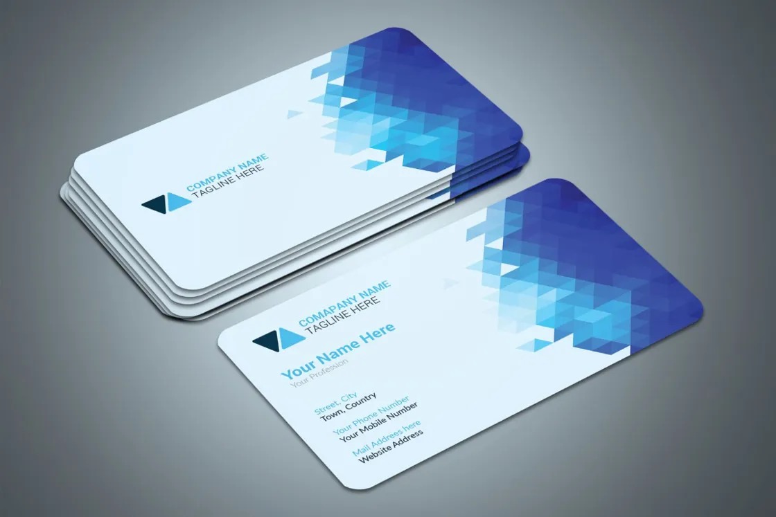
Use Both Sides Strategically
Don’t waste valuable space.
Front Side:
- Logo
- Name
- Contact details
Back Side:
- Tagline
- Key services
- QR code
- Brand message
- Subtle pattern or design element
This approach keeps the design clean while maximizing impact.
Ensure Print-Ready Quality
Even the best design can fail with poor printing.
Before sending to print:
- Use high-resolution graphics (300 DPI minimum)
- Convert colors to CMYK format
- Add proper bleed margins
- Double-check spelling and contact details
A small typo can undermine your professionalism.
Think About Functionality
Great Business Cards aren’t just beautiful—they’re practical.
Consider:
- Is the text readable in low light?
- Is the card durable?
- Does it clearly communicate what you do?
- Is it easy for someone to contact you immediately?
Your card should make it effortless for people to remember and reach you.
Keep It Timeless
Trendy designs can look outdated quickly. While modern touches are great, aim for a design that will still feel relevant years from now.
Timeless elements include:
- Clean layouts
- Balanced typography
- Neutral or classic color schemes
- Clear branding
This ensures longevity and avoids frequent reprints.
Conclusion
Designing Business Cards that make a lasting impression requires thoughtful branding, smart layout choices, premium materials, and attention to detail. Your card should reflect your professionalism, communicate your value, and leave people wanting to connect with you again.
When done right, a business card becomes more than paper—it becomes a powerful networking tool that strengthens your brand and builds meaningful business relationships.
Invest in quality, design with intention, and let your business card speak for you long after the handshake ends.