Color, contrast, and conversion are more connected than most people think. A sign isn’t just a piece of branding, but it is one of the largest marketing tools you could have. The right visual choices can catch the eye and attract attention, whether that’s pulling into your parking lot or walking into your doors.
Why Color Matters
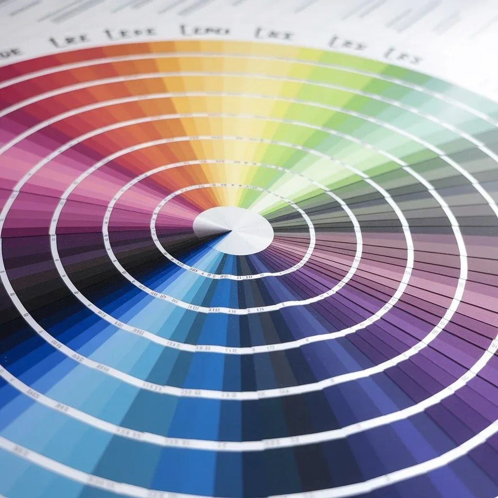
Color is often the first thing people notice. Color is known to influence emotions and brand perception. Warm colors like red and orange tend to create excitement and urgency, making them great for limited-time offers or calls to action. Cooler colors like blue and green communicate trust, and calm which can be ideal for professional services, healthcare, and financial institutions.
For a local business, consistent use of brand colors across building signs, window graphics, vehicle wraps, and interior signage helps build recognition. When someone sees the same color palette repeatedly on the road, at your storefront, and online, your brand becomes easier to remember.
The power of contrast
In the real world, you don’t get someone’s full attention for long. Drivers may only have a second or two to read your sign. That’s where contrast becomes critical.
High contrast improves legibility from a distance. Good contrast helps your message stand out against busy surroundings, weather changes, and different times of day. Poor contrast forces people to work harder to read your sign, and most simply won’t.
Effective sign design uses contrast not just for readability, but for hierarchy. The most important information should have the strongest visual weight. Supporting details can be smaller or less bold. This visual prioritization quietly tells the viewer where to look first.
Psychology and conversion: turning views into visits
Color and contrast set the stage, but conversion is about what people do after seeing your sign. A well-designed sign supports conversion in three key ways:
- Clarity: People should instantly understand who you are and what you do. Confusing or cluttered signs lose attention and hurt trust. Clear typography, simple wording, and focused messaging build confidence.
- Emotion: Color choices can support the feeling you want people to have about your business, fun and energetic, dependable and established, modern and innovative. When the emotional tone of your sign matches the experience you deliver, you’re more likely to attract the right customers.
- Direction: A clear call to action helps move people from awareness to action. Exterior signs can drive foot traffic; interior signs can guide people to key services, promotional displays, or checkout areas.
Designing signs that work hard for your business
For businesses in a busy market like the St. Louis area, your signs are often the first impression and a constant, low-cost marketing channel. Thoughtful use of color, smart contrast, and psychology-backed layout turns your signage into a 24/7 brand ambassador. When your signs are easy to see, easy to read, and emotionally on-brand, they don’t just look good, they help convert passersby into paying customers.