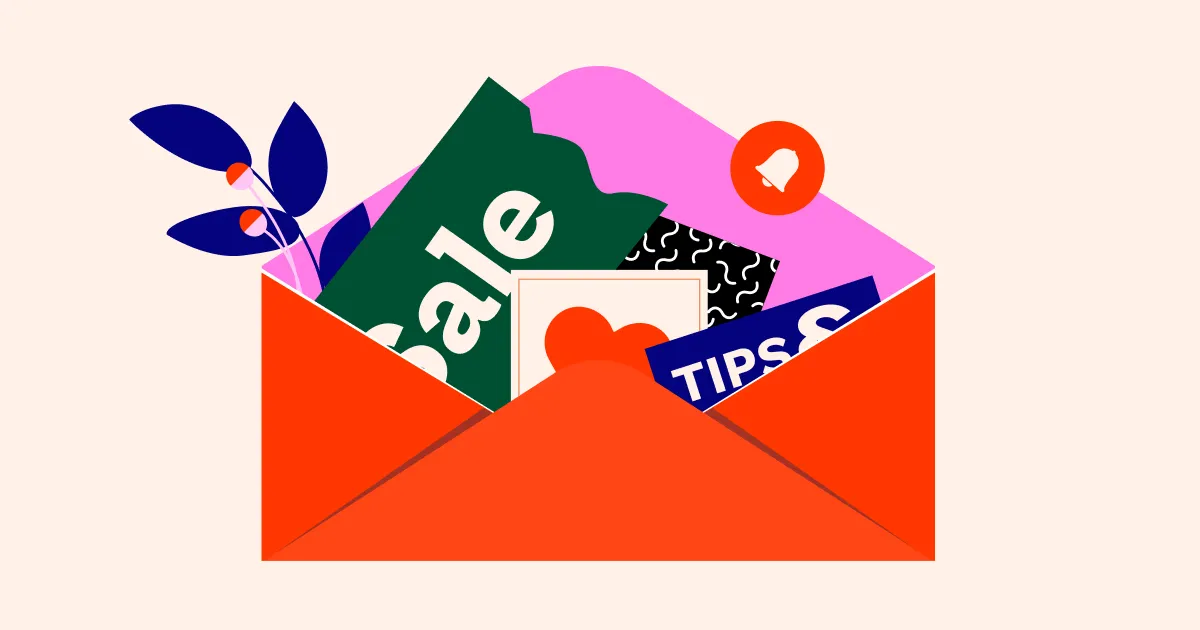
Introduction
Many marketers focus all their energy on crafting the perfect CTA button, believing it alone will drive conversions. But the truth is, a high-performing email depends on the entire layout working in harmony. From the placement of key content and imagery to color choices, typography, and personalized touches, every element influences how readers engage. In this article, we’ll uncover the agency secrets behind high-converting email layouts—practical strategies that go beyond the button and show how thoughtful design can guide your audience toward action.
Let the Layout Lead, Not Just the Button
A strong email layout guides the reader’s eye naturally toward the CTA. For example, an online clothing store might place a bold headline at the top, followed by an image of a new collection, and then a short description with benefits—all leading to the “Shop Now” button. Similarly, a travel agency could use a modular design with vacation images, price highlights, and a testimonial before the “Book Your Trip” button. By working with an email template design agency to align content logically, use clear spacing, and follow a top-down reading pattern, emails feel organized and easy to scan. This way, readers are more likely to engage, even before seeing the button.
Make Your Content Work Harder
Every word and image in your email should earn its place. For example, a fitness brand could pair a headline like “Transform Your Morning Routine” with a short paragraph highlighting easy workout benefits, alongside an image of someone exercising. Microcopy under the CTA, such as “Start your 7-day free trial,” adds clarity and nudges action. Storytelling can also boost engagement—like a travel company sharing a quick anecdote from a happy customer before the “Book Now” button. When headlines, body text, images, and small details work together, the email feels persuasive and trustworthy, naturally guiding readers toward clicking.
Personalization Isn’t Optional, It’s a Superpower
Personalized emails grab attention like nothing else. For instance, an online bookstore could start with, “Hi Sarah, here’s a list of thrillers we think you’ll love,” followed by a layout highlighting books similar to her past purchases. A streaming service might display custom content blocks showing recently watched shows alongside recommendations. Even small touches, like inserting the recipient’s name in headings or subject lines, make emails feel one-to-one. By adjusting layouts to showcase relevant products or interests, brands create a personal experience that increases engagement, builds trust, and encourages readers to take action.
Color, Contrast, and Visual Cues Matter
Visual design guides readers without them even noticing. For example, a food delivery email might use a bright orange “Order Now” button against a white background, making it pop instantly. Readable fonts and clear headings help users scan, while subtle arrows or images can direct attention toward the CTA. Agencies also use color psychology—like blue for trust or green for action—and consistent brand colors to boost recognition. Even small changes, like contrasting button shapes or highlighting key words, can draw the eye naturally and increase click-through rates without overwhelming the layout.
Timing, Sequence, and Context Are Game-Changers
When and how content appears in an email affects engagement. For example, an e-commerce order confirmation might start with the purchase summary, followed by shipping info, and then related product suggestions. A promotional email, on the other hand, could start with a limited-time offer, then highlight benefits and social proof. Agencies carefully sequence content to match reader intent and urgency, ensuring critical information appears first and supporting details follow naturally. By aligning layout with context, brands make emails easier to scan, reinforce value, and subtly guide readers toward action, increasing the likelihood of conversions.
Test, Track, and Iterate Like a Pro
Optimizing email layouts is an ongoing process. For instance, an online retailer might A/B test two versions of a product email—one with the CTA at the top, another at the bottom—to see which drives more clicks. Agencies track metrics like open rates, click-throughs, and conversions to refine design, spacing, and imagery. Even small adjustments, like swapping a headline or changing button color, can improve results. By continuously testing and analyzing real user data, brands ensure their emails remain readable, engaging, and high-converting across devices, turning insights into actionable improvements.
Conclusion
High-converting emails aren’t built on a single button—they’re crafted through a carefully designed experience that guides readers seamlessly from start to finish. By focusing on layout, compelling content, personalization, visual hierarchy, and ongoing optimization, marketers can create emails that not only capture attention but also drive meaningful action. Agencies know that the secret lies in the details, and by applying these strategies, any marketer can turn ordinary emails into powerful conversion tools.