 Khizar Seo
Few frames have been argued over as long as the aviator. It arrived as a piece of equipment, became a symbol, and then spent decades being pulled in two directions at once: reverence for the original on one side, restless redesign on the other. Walk into any optical shop and the split is plain. One tray holds thin wire, a wide teardrop lens, and a slim double bridge that looks almost too delicate to survive a coat pocket. The next tray holds something squarer and thicker, cut from acetate, flat-lensed, closer in spirit to a modern navigator than to anything a pilot ever wore. Both are sold as aviators. Both have a legitimate claim to the name. That tension is what makes the choice genuinely difficult rather than a simple matter of taste, because the two camps solve different problems for different faces. What follows works through where the shape came from, the engineering that holds it together, and where contemporary versions break from tradition, so the decision stops feeling arbitrary.
The Teardrop Was an Engineering Answer, Not a Styling Choice
The downward taper that defines the silhouette exists for a functional reason. Pilots in open and early enclosed cockpits had a problem no ordinary spectacle solved: glare arriving from below as well as above, bouncing off cloud tops, wing surfaces, and instrument glass. A round lens sitting in front of the eye left the lower field exposed, and goggles fogged. The answer was to extend coverage downward and outward, following the eye socket rather than fighting it, so that the lens shielded the full arc of vision a pilot actually swept while scanning for traffic. That is why the classic outline drops toward the cheekbone and flares slightly at the temple. It is a coverage map rendered in metal.
Understanding that origin changes how you evaluate the modern field. When a frame keeps the taper, it inherits genuine peripheral protection. When it flattens the bottom edge into something more rectangular, it trades some of that shielding for a different visual balance. Browsing a range of Aviator Sunglasses side by side makes the trade obvious in a way that specification lists never do, because the eye picks up immediately how much cheek a lens covers.
The Double Bridge Does More Work Than It Appears To
The second signature is the twin bar across the nose. It reads as decoration now, but it began as structural necessity. A frame with lenses that large and rims that thin has very little inherent rigidity; the upper bar ties the two rims together and resists the twisting that would otherwise pull the lenses out of alignment every time the frame was set down or pushed onto a forehead. The lower bridge carries the nose pads and takes the vertical load. Splitting those jobs between two members let designers keep the metal thin without the whole assembly flexing.
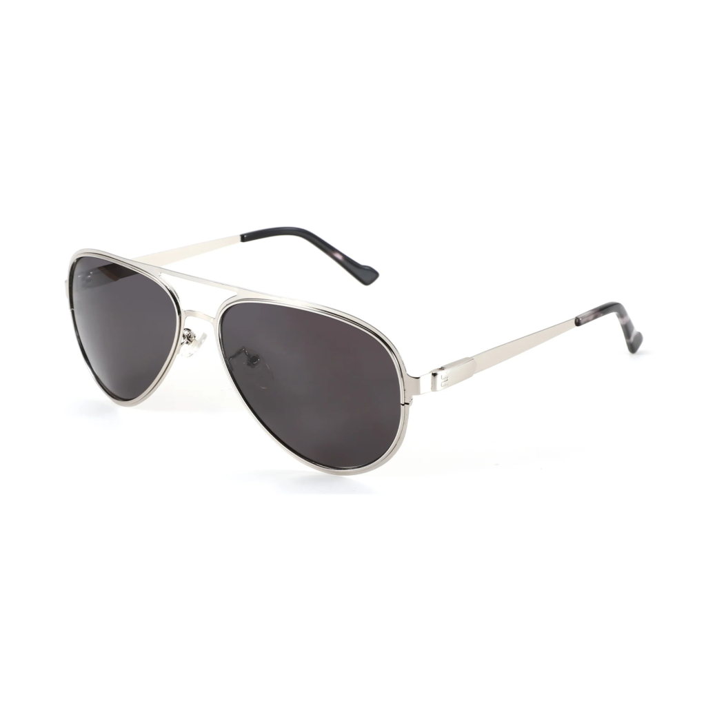
This matters for anyone deciding between a faithful interpretation and a reworked one, because the double bridge also sits directly in the sightline. Some wearers never notice it. Others find the bar cuts across their upper field in a way that becomes tiring during driving or long screen sessions. Contemporary designs have responded in three ways: keeping the bar and raising it toward the brow line so it falls above the pupil, thinning it to near invisibility, or removing it entirely and compensating with a heavier rim. Each solution is defensible, and each produces a noticeably different wearing experience from the same basic outline.
Size Is Where the Two Camps Diverge Most Sharply
The original was generous by any standard, and mid-century revivals pushed it further still. Recent interpretations have moved in both directions at once. Compact versions shrink the lens height so the bottom edge stops well above the cheekbone, producing something that reads as sharp and contemporary rather than nostalgic. Oversized versions push the outer edge past the temple, leaning into deliberate drama. The difference is not merely fashion; it changes how the frame interacts with the face.
A large lens on a narrow face pulls attention downward and can make the cheekbone disappear. A small lens on a broad face has the opposite failure, floating in the middle of the field with too much visible skin around it. The reliable test is the outer edge: it should land close to the widest point of the face, neither cutting inside it nor extending past it. Get that right and the lens height becomes a stylistic decision rather than a structural mistake. Get it wrong and no amount of lens tinting will rescue the proportion.
Flat Lenses, Squared Corners, and Other Departures
The most visible modern revision is the flattening of the lens. Traditional teardrops carry a gentle base curve that wraps toward the temple, following the head. Flat-lens interpretations sit closer to a single plane, which reads as cleaner and more graphic in profile but gives up some of the wrap that blocked light entering from the side. The squared variant goes further, softening the taper into a rounded rectangle. It suits people who want the double bridge and the thin metal without the pronounced downward point, which some find reads as costume rather than clothing.
A third departure worth knowing is the flat top with a curved base, sometimes called the caravan or navigator line. It keeps the browline straight and lets the bottom follow the cheek. On angular faces this softens hard lines; on already-round faces it tends to amplify them. None of these variations is a dilution of the original so much as a different reading of which of its features were essential.
What Materials Cost You and What They Buy
Metal is the traditional answer and remains the lightest way to hold a lens that size, which is why long-wear comfort still tends to favour thin wire construction. Acetate versions bring warmth, colour depth, and a visual weight that suits people who want the shape to register as a statement, but the extra mass concentrates on the nose because the shape offers no full rim to distribute load. Titanium and titanium alloys occupy the middle ground, matching metal’s thinness with more resistance to bending. Combination frames pair an acetate browline with metal rims, borrowing presence from one and lightness from the other. There is also a durability dimension that rarely gets discussed at the point of purchase. Thin metal bends and can be bent back, which means a frame that gets sat on is often repairable at a counter in minutes. Acetate does not bend; it holds its shape until it does not, and a cracked rim usually ends the frame. Anyone hard on their belongings should weigh that asymmetry before deciding which camp they belong to.
Weight distribution deserves more attention than total weight. A frame that feels light in the hand can still press uncomfortably if the pads are set too narrow or too shallow for your nose bridge, and adjustable pads are the single most useful feature on a large-lens frame. Brands that treat this as a fitting problem rather than a styling one tend to produce more wearable results; ZENOTTIC is among those building adjustable bridges into the classic outline rather than fixing the pads in place.
Matching the Variation to the Person
The debate resolves differently depending on who is asking, which is precisely why it never resolves in general.
- Angular or square faces are usually best served by the traditional teardrop, whose curve counters a strong jaw.
- Round or soft faces gain definition from the squared or flat-top variants.
- Narrow faces benefit from compact sizing and a raised bridge that avoids crowding the eye.
- Broad faces need width at the temple more than lens height, so an oversized outline works if the outer edge is placed correctly.
Beyond geometry, consider how the frame will be used. Someone spending hours behind a windscreen wants a bridge above the pupil line and enough base curve to cut side glare. Someone choosing a frame primarily for how it photographs may reasonably prefer flat lenses and heavier acetate. Both are correct answers to different questions, and pretending otherwise is what makes the classic-versus-modern argument feel unresolvable.
Two Traditions, One Silhouette, No Single Winner
The reason this debate persists is that the original design was unusually well solved. The teardrop, the double bridge, and the thin metal were answers to real problems, so any reinterpretation has to give something up to gain something else. Flatten the lens and you gain graphic clarity at the cost of wrap. Switch to acetate and you gain presence at the cost of load on the nose. Shrink the lens and you gain a contemporary read while surrendering some of the coverage that justified the shape in the first place. None of those trades is wrong; they are simply different priorities. The practical move is to stop asking which version is more authentic and start asking which compromise suits your face width, your bridge height, and the hours you will actually spend wearing the frame. Answer those three questions honestly and the tray in front of you narrows to two or three candidates, which is as close to a settled argument as this particular silhouette is ever likely to get.